
LayoutAI
A comprehensive human-centered AI research to develop an adaptive AI-driven tool
EMPLOYER
Megaputer Intelligence Inc.
TEAM
Human-centered AI researcher (me). This is an independent UX case study to explore the possibilities of AI
YEAR & DURATION
2025_ 2 weeks
OUTCOME
Defined guidelines for designing an adaptive AI-driven tool that removes repetitive layout decisions, allowing data analysts to concentrate on insights rather than interface design
WHAT DID I DO?
Problem
Host Layout canvas is underutilized by users, why?
Design Solution
Designed an adaptive AI-enhanced layout design tool built in Host Layout canvas
Impacts
Designed to make the layout process smarter and more intuitive, empowering users and enhancing clarity in report interpretation
INTRODUCTION
This independent project explores how Human-Centered AI (HCAI) Design principles can improve dashboard usability. While working with Host Layout, a dashboard design feature at Megaputer Intelligence, I observed opportunities to reduce repetitive, time-consuming layout tasks using AI
Although this project was not part of my workplace deliverables and has not been launched, I used it as a research and design exercise to demonstrate how I can apply HCAI guidelines to design AI-driven features.
The result is LayoutAI — a conceptual assistant that generates intelligent, user-friendly report dashboard layouts
CONTEXT & PROBLEM
The Tool
Host Layout allows analysts to build dashboards by manually arranging components such as charts, filters, and tables
Observed Pain Points
-
Users often struggle with repetitive, manual placement of components
-
Non-designers find it challenging to produce visually balanced dashboards
-
The absence of starting guidance slows down workflow efficiency
-
Opportunity
Opportunity: Could AI generate helpful starting layouts and adapt to user preferences, enabling analysts to focus more on insights rather than interface details?
HUMAN-CENTERED AI DESIGN PROCESS
Identify
if & how to use AI
Translate
needs into data
Explain
your AI system
PATTERNS
Identify clear user's need & associated behavior pattern
Needs
Design report layout effortlessly
Select the most appropriate visualization tools for a given dataset
Pattern
Repeatedly gathering data & making appealing report dashboards to communicate data
SUCCESS
Identify clear definition of success
Success indicators
Quickly make report dashboards
Higher consistency across reports
Increased user satisfaction and trust
Effortlessly create report dashboards
Optimization goals
-
Automatically suggest optimal layout structures based on content
-
Recommend the most suitable visualizations charts (tools) to support the story behind the data
-
Assist in aligning visual hierarchy for more effective communication
SCOPE
Identify if non-AI solution could work
Because most users are not design experts, an AI-driven solution can offer personalized, dynamic assistance, making intelligent decisions based on context, user goals, and past behaviors
TYPE
Identify which type of AI; Automation or Augmentation?
Automation
Why? Because tasks are repetitive, low-stakes, and time-consuming
How? By suggesting layouts and visualization while allowing users to customize and teach the system over time
ALIGN
Align needs with AI inputs & outputs data
User needs
Assist in creating well-designed, communicative dashboard layouts
Recommend suitable visualizations based on the context
Enhance storytelling and insight clarity without requiring design expertise
AI output
-
Smart layout suggestions (placement, grouping, sizing)
-
Recommended visualization types per data set (e.g., bar, pie, line)
-
Dynamic storytelling enhancements (e.g., annotation, ordering insights)
Input data need
Data source type
e.g., sales, customer feedback, inventory
Report goals
e.g., highlight anomalies, show trends
Stakeholders, audience
e.g., executives vs. analysts
User interaction preferences
e.g., how they want dashboard to be
Data format and industry
e.g., categorical vs. time series, finance vs. healthcare
Design Insight: We must ensure the system captures not just raw data, but context, who the data is for and what the user wants to communicate
MAP
Transform data & user behaviors into structured dataset to train AI models
Some mapping examples for this project:
Log layout patterns
Capture user component placement and the frequency of successful use of specific configurations
Tag component interactions
Assign user actions tags such as "repositioned" and "removed" and associate them to context
Track layout outcomes
Track signals of successful design such as share, export and save
Use design heuristics as labels
Help AI to learn clean and readable layout by mapping out design metrics like white space, grid alignment accuracy, visual hierarchy and etc
SOURCE
Build or source a divers dataset
Sourcing strategy
-
Collect dashboards and usage data from a wide range of industries (e.g., healthcare, retail, education)
-
Include users of varying skill levels; both power users and novice users
-
Use internal reports and synthetic layouts created by experts for edge cases
-
Conduct usability testing across different personas to label “successful” vs. “ineffective” dashboard designs
This strategy will train and test data from various users, domains, edge cases, and report styles to create an inclusive and generalizable solution
TUNE
Personalize & improve over time
Tuning strategy
Get direct feedback from users
e.g., thumbs up/down or "why this?"
Introduce collaborative filtering
e.g., “people with similar data types used this layout”
Adjust layout logic based on user corrections
capture these as “learning moments”
Design implication: Include feedback moments that feel natural, not like training an AI. “Would you like a cleaner version of this layout?” is better than “Rate this algorithm.”
TRUST
What information is needed to build calibrated trust?
Explain why
Explain the rationale behind a specific layout or suggested visualization, as well as the influencing factors
Modifiability
Let users have controls over AI suggestions and alter them
What will happen next?
Explain what might happen if they accept or ignore the suggestion
User mindset insight: Data analysts aren’t afraid of customization, they simply don’t want to start from scratch every time. They seek to see reasoning and maintain control
EXPERTIES
Consider user's technical expertise
Design Considerations:
-
Avoid jargon like “optimal visual hierarchy”
-
Provide optional deep dives for power users (e.g., “See why this chart style was picked based on data type”)
The primary users of the layout feature are data analysts. They are tech-savvy in terms of working with datasets and metrics, but not necessarily trained in visual design or UX
DISPLAY
Should we display AI confidence?
Yes, but carefully!
Confidence indicators are helpful if they inform action. In LayoutAI, confidence can be shown with:
Multiple layout options with pros and cons
Recommending based on user behavior than a design rule
Showing missing inputs
DESIGN DELIVERABLE
LayoutAI
Let the AI arrange your dashboard while you focus on insights
An AI-powered assistant built directly into the Host Layout to help data analysts spend less time arranging dashboards and more time telling impactful stories with data

LayoutAI feature
Each report page tab now contains a new feature called LayoutAI. LayoutAI can create a user layout by describing their preferred design and adjusting specific parameters

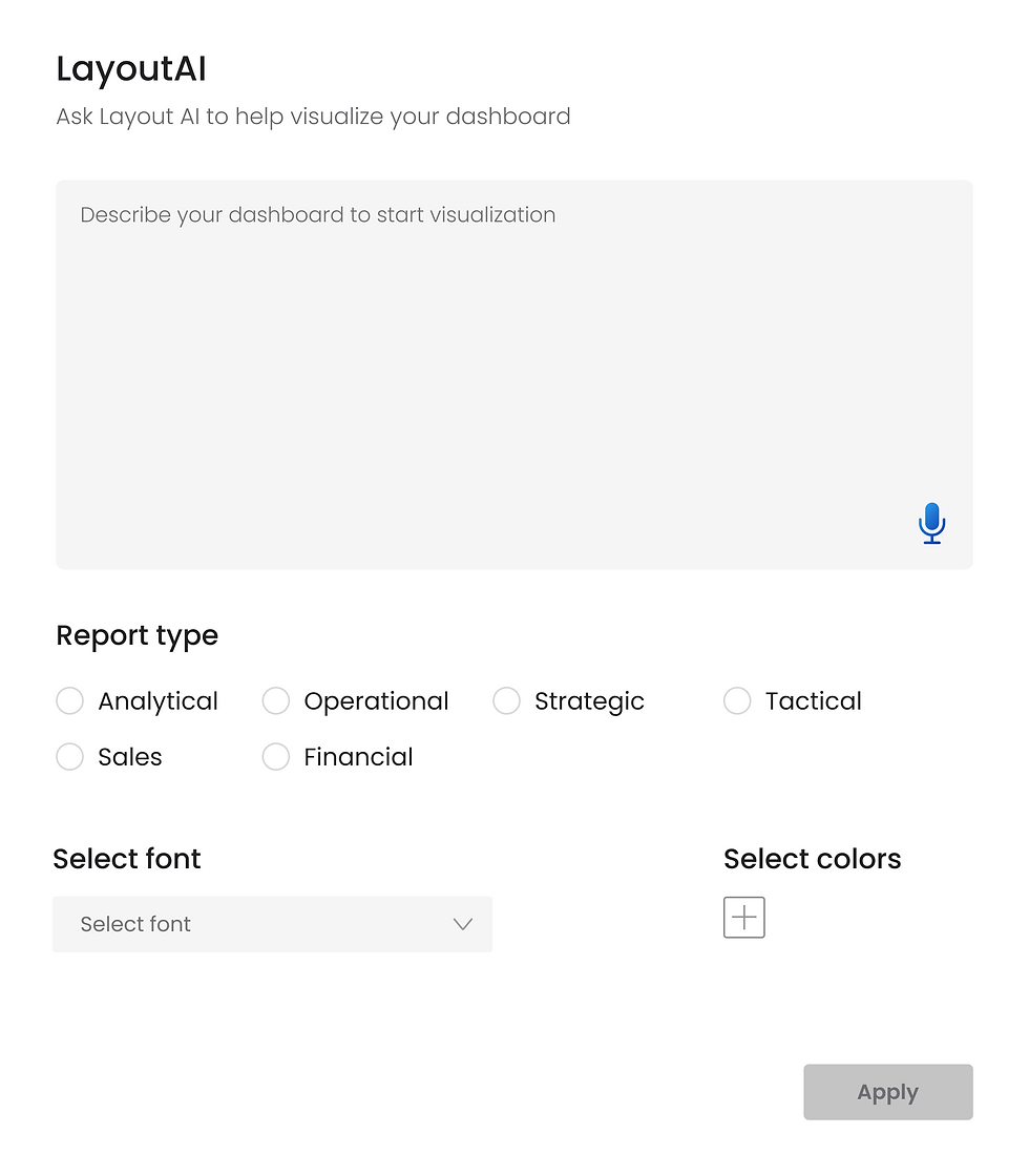
LayoutAI menu
Clicking the LayoutAI icon opens this menu. Users can enter a description, and the AI generates a report dashboard based on their inputs

LayoutAI trust
Selecting "Why this layout works" gives users a choice over this recommendation while illuminating the reasoning behind AI decision-making, which is essential for fostering user-AI trust
Host Layout Canvas - Usability Redesign
A drag-and-drop canvas for creating report dashboards
EMPLOYER
Megaputer Intelligence Inc.
TEAM
Lead designer (me), CEO, and two software engineers
YEAR & DURATION
2024_ 3 weeks
OUTCOME
The Host Layout was a powerful but underutilized feature. My redesign turned it into a scalable and reusable system for building report dashboards