Landing Experience Redesign
Landing page for enterprise software called PolyAnalyst
EMPLOYER
Megaputer Intelligence Inc.
TEAM
Lead designer (me), CEO, data analysts, and two software engineers
YEAR & DURATION
2025_ 1 week
OUTCOME
Delivered a clean, accessible, and conversion-optimized landing page, improving user navigation, information clarity, and overall engagement
90% User Satisfaction | New Design System Components | 0% Error Rate | Higher User Engagement
Overview
PolyAnalyst is a powerful enterprise analytics platform that houses six applications used across multiple roles, from data analysts to administrators and cybersecurity personnel.
THE PROBLEM
I identified key UX issues through user interviews and goal mapping.
(Users: data analysts, marketing manager, CEO, and administrators)

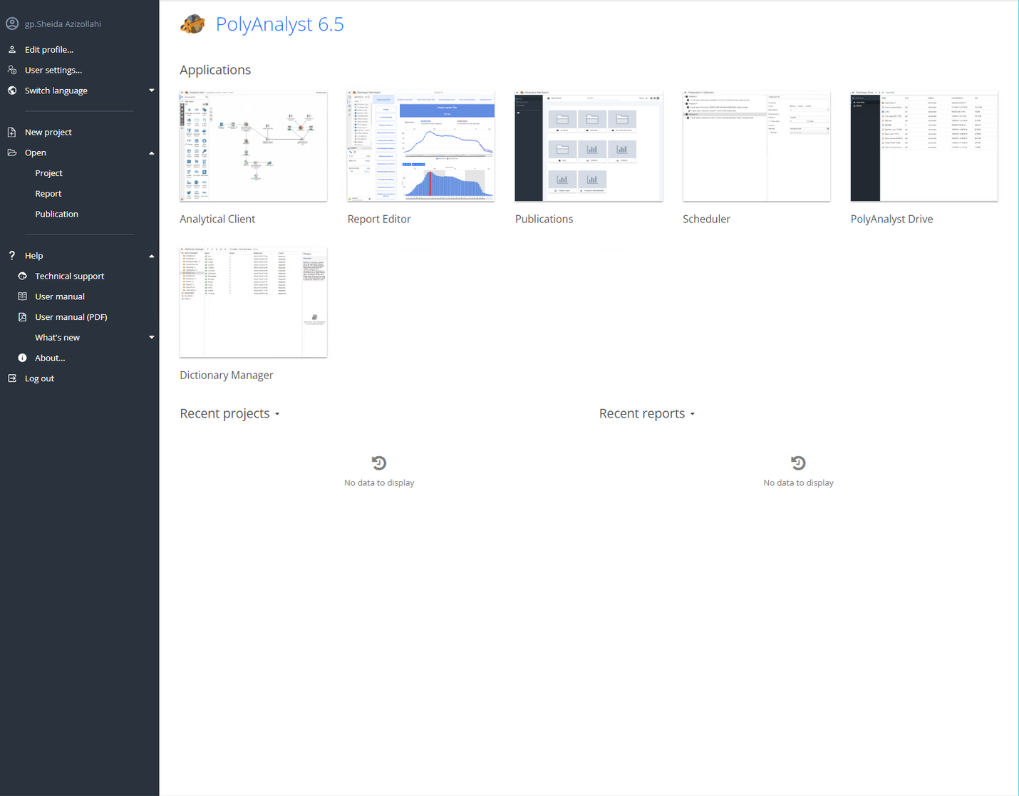
Current design
- Weak onboarding
The screen does not guide users toward the primary next step, leading to higher cognitive load and time-to-action.
- Unprioritized hierarchy
All application tiles appear equal in visual weight, even though some are more important; this increases decision-making friction.
- Information overload
Multiple sections (Applications, Recent Projects, and Recent Reports) compete for attention. Users struggle to quickly decide where to focus, which slows down task completion.
- Poor whitespace management
Makes the page feel cluttered.
GOALS
- Streamline the first-touch experience of PolyAnalyst
- Support new and returning users
- Reduce cognitive load, improve discoverability
- Supporting continuous learning
- Drive higher adoption and user satisfaction
DESIGN SOLUTIONS

Information architecture redesign for role-based first touch
To support the very different needs of first-time and returning users, I separated the experience into two dedicated spaces:
-
Getting Started: An onboarding-focused space containing tutorials, learning resources, and “What’s New” updates
-
Home: A productivity-focused space for returning users, prioritizing rapid access to primary tools and recently opened projects.

Streamlined navigation between recent and favorite projects
Users can now toggle between Recent and Favorites instantly instead of using drop-down menu, speeding up project resumption and aligning with common UI behavior patterns.

Usability heuristic: recognition over recall (Home page)
I introduced clearer tool visualization using distinct icons paired with labels, improving scannability and tool recognition. Because these icons are used consistently throughout the software, they reinforce memory and follow established usability heuristics.
Cleaner UI through visual hierarchy and layout improvements
I applied whitespace, consistent iconography, and typographic hierarchy to reduce cognitive load and scanning effort. Primary tools are visually elevated, secondary tools are de-emphasized.
MULTI-LAYER IMPACTS
User impacts
- Lower cognitive load & decision friction
- Supporting both novice & experienced users
- Improved overall work efficiency
Product impacts
- Higher user engagement with new features by "What's new" and "Getting started" sections as well as clearer hierarchy
- Improved onboarding and feature discoverability
System Impacts
- Expanded the design system with reusable components
- Established a scalable content structure, allowing the platform to grow
+ 90%
Satisfaction score
0%
Error rate
MY TAKEAWAYS
Design for scalability - I learned that designing for scalability goes beyond visual polish; it’s about thinking in systems. Every new component added to a design system must be future-proof, consistent, and flexible enough to adapt to evolving product needs.

